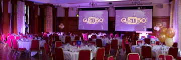
On October 18th, 2014, Glasgow University Student Television celebrated their 50th Anniversary. The oldest student Television Station in the world, volunteers have been making films and TV programmes since 1964. The occasion was marked with an exhibition and alumni dinner attended by over a hundred guests, including current students and alumni from all five decades, in the Glasgow University Union.
This post has been edited in October 2015.
Behind the Scenes
As University started back in September, and as I returned to Glasgow from my stay at home with the family, I soon got sucked back into the wonderful world of GUST. This post is an attempt to present what happened behind the screens of GUST’s 50th Anniversary event in October, and during the lead up to it in the planning phase beginning almost exactly a year prior to this. At the time, I was asked to be Webmaster for the project, with a very short brief (blog posts, photos, and promotional videos). Luckily, I decided to take on a bit more responsibility for shaping the event as it drew closer. Yes, there have been petty arguments, yes, there may have been a few tears, yes, the last two weeks were very stressful for all of us, but all this was worth it for an incredible event that could not have happened without everyone on the team chipping in with their very best, as they did.
Website
The Website had to support two main functions. Firstly, and likely most importantly to the project coordinators, we had to advertise the ticket sales, which were handled through a separate website, and provide all the crucial details for the event itself. Secondly, I wanted to build an engaging online exhibition mirroring the archive content that we had been collecting for a while now, and which was going to be displayed at the event in October. Finally, we wanted to introduce the GUST 50 team with photographs, short biographies, and contact details. Most of this I had previously (November 2013) built using a very slightly modified version of the WordPress default theme, TwentyThirteen, and a few plugins. While visually not very interesting, it fulfilled the main function of introducing the event as the project got started. However, as more and more custom functionality was required, and I started making up sketches for a complete redesign and the addition of the History section, I decided to build a completely new theme and design during the summer months 2014.
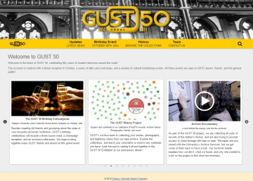
For the new theme I went for a relatively minimalistic design based on the wonderful HTML 5 Boilerplate theme: This gave me a blank canvas with the file and PHP structure for a WordPress theme already in place. I built on this to support custom post types (history records) and custom page templates (homepage, contact page). The colour scheme was also kept simple, being mostly based around black text, white backgrounds, and the GUST 50 Gold/Yellow from the Logo becoming an additional accent colour. This later carried over into the print design, where an additional background-colour (magenta-red) was introduced to complement it. The site launched with much the same content as before but a new look when I returned to Glasgow in September, and I gradually extended it on the content side. More history records were added, and the History Graph was introduced, too.

The History Graph is a D3.js based interactive network visualisation of the interlinked History Records, showing relationships between the items, and allowing users to playfully explore the rich content collected for the Archive Project. The D3 Force Layout was used to calculate node positions, these were then rendered as an SVG image, and HTML overlays were used to provide rich context information when a user selected a node by hovering over it with the mouse, or tapping it on a touch-based device. Eventually, the site mirrored almost exactly the content that was being collected for the offline exhibition at the same time, and I will continue working on this as we receive more submissions from alumni, or as we publish more archive video material.
Event Planning
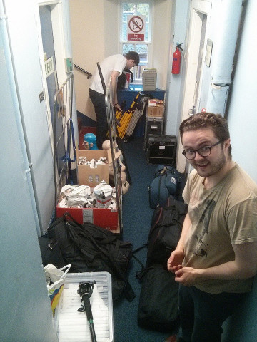
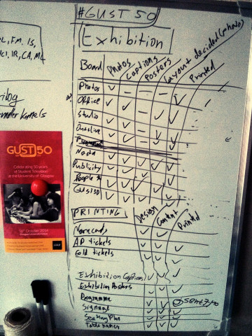
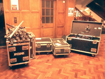
As the Golden Anniversary event drew closer, in late September we all stepped up our efforts to make it the best night possible. Teams were working on decorations, financials, promotion of ticket sales, fundraising through separate events such as the Glasgow Showcase, Technical Equipment planning, and, with me, on the exhibition, pretty much non stop until the night before and even on the day. The technical team and many dedicated helpers worked long hours from Friday to Sunday, moving in and out the lighting equipment, exhibition materials, photo booth, and many other things.
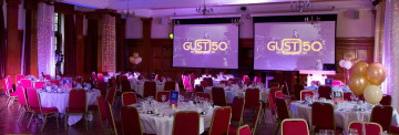
On the night, we had two projector screens in the Dining Hall, which alternated between video playback for the introduction, speaker name cards and a placeholder image for the speeches, and a randomized version of the History Graph during dinner. I used VLC player, set to “repeat one”, with a playlist of the images and videos for this. A wireless keyboard with media keys controlled the playback, and could also be used to alt-tab into fullscreen Chrome which ran the History Graph.
Print Design
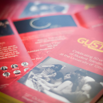
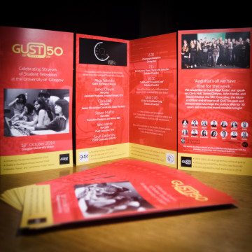
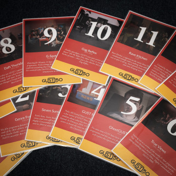
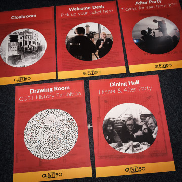
I suggested controlling almost all the print design for the event, which included the Exhibition Posters, Tickets, Programmes, Dinner Menus, Seating Plan, Signage, Table Names, and even the name cards for Guests. This made sure the whole evening was branded and came off as one consistent event. The name card font, and the background image from the tickets, were used to create projection slides for the dinner, introducing our speakers. The colour scheme was coordinated with tickets, programmes, posters, table names, and seating plan all using the same style. We made use of archive photographs in black and white, and a few more recent colour photographs, to establish the far-reaching history of the station. For context, the tables were named after past and present GUST shows, with a paragraph about their history. The evening Programme, besides the event information, contained a few factoids about the station’s history, set along side older versions of the logo that were used at the time. The programmes were printed as a single-fold DL flyer on glossy 250gsm paper by print24. All other materials were printed at the SRC’s offices, on 160gsm light card for a feel much nicer than the regular copier paper. All print design work was done in Adobe InDesign CS6.
Exhibition
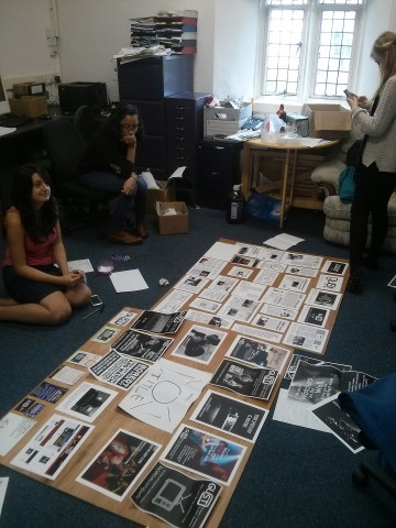
The History Exhibition was, in my opinion, going to be a key point of the event. It was meant to bring together GUSTies from all generations, exchanging stories, to stir up long lost memories, and provide a history of the station’s legend for the uninitiated. Ana Maria helped me a lot in selecting content, fitting everything into a coherent theme, and deciding on the best utilization of the available space, to give visitors a clear and sensible path through the exhibit.
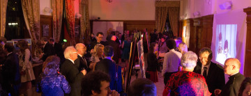
The GUU’s Drawing Room was filled with posters, projections, lights, and GUST memorabilia to create an engaging exhibition space.
A few poster boards and stands were hand-built from plywood by Arif and myself. Photographs were printed at a lab and glued to pre-printed frames with captions, and each board had a specific theme, which was established by its title card, designed similarly to the signage posters. These were complemented with a projected video loop, edited by Anna B., projected onto a white sheet covering a wall, a display of NaSTA award trophies dating back to 1973, a few additional boards full of smaller photos from all ages, and some old props and filming equipment. Old documents, such as annual reports, were printed off and distributed in the seating areas in the exhibition for interested readers. Some guests further contributed to the exhibition’s success, by returning a long thought lost award trophy, and some fact sheets about the technical equipment used in their time.
Photobooth
In the beginning, Anna GG suggested that we should have a photobooth. A bit sceptical, especially at the mentioning of silly hats and other wild ideas for props and a golden glitter curtain at the back, at first, I must say this has turned out to be another key engagement point for our guests, including myself, it was a lot of fun for them and our photographer volunteers alike, and the photos proved very popular on Facebook later, too.
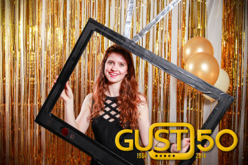
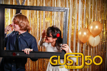
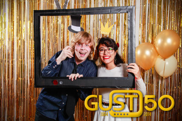
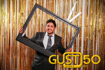
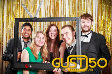
On the technical side, Martin, Brendan, Arif, and I planned a large white back drop (to be covered in gold curtain), two speed-lites (430 EXII) with shoot-through umbrellas, radio triggers, a 5D Mark II on a tripod taking the pictures, and a laptop for tethering to the camera. The night before, we figured out this was not quite what was going to happen, due to trouble sourcing the speedlite holders for our umbrellas and the radio triggers. So in the end, we had one speedlite through the umbrella from camera right up, another bare speedlite as hair light from behind the subject, camera left, and the setup was triggered by a 580 EX on the 5D. Photos were captured to Brendan’s Macbook Pro directly into Lightroom. Its Second Screen was shown in fullscreen mode on a large TV we carried down from our office, to give our guests instant feedback on their photos. One thing we didn’t consider early enough was how many batteries the lights would end up using. Luckily, we had a large box of spare AAs at hand, but had we changed them earlier, we could have avoided many dark frames caused by the growing refresh times of our Speedlites as the batteries discharged.
Third Party Photo Credits
Dining hall and Exhibition photos: Event photography by Gavin Reynolds for GUST.
Photobooth photos: GUST volunteers.
 Kristian Hentschel